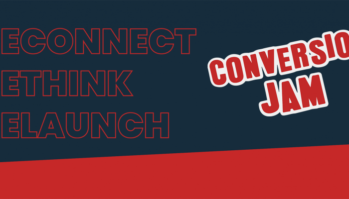
This second part of the article will cover mistakes 4-6
- Ignoring the importance of the preview pane
- Not setting clear conversion goals for each email
- Not maintaining the scent from the email on the landing page
NOTE: every screenshot is clickable if you want to see the details.
Mistake nr 4 – Ignoring the importance of the preview pane
Why am I obsessing about subject lines and preview panes?
Because the decision to open or not open is solely based on what the recipient sees in the subject line and in the preview pane.
 So how common is preview pane reading? Isn’t only business (=outlook) users who do that? That has no relevance for B2C email marketing, has it?
In their 2008 Consumer media survey, Marketing Sherpa reported that 53% of users use preview for personal email. So it is relevant, very relevant.
Let’s go back to my inbox for some examples.
Preview completely ignored

Addnature Preview
Click any of the thumbnails for a detailed view!
Addnature
Remember that nice-looking newsletter from Addnature which I showed in part 1 of the article? Here’s what the preview looks like, Not a whole lot of “persuasive content” there, is it?
MailCom Europe
The email entitled “Information about Newsletter” (Lame title warning!).has two big images on the top so that you have to scroll down the preview to see anything.

What makes this particular email interesting is that MailCom is claiming that they have “The best tool in the market for email marketing”. This clearly proves my earlier point about email system providers being clueless about conversion and how content should be handled in their systems.
IDG

IDG’s party invitation contains nothing but a link “If you can’t see the invitation below, click here”, – Of course I can’t, it’s an image only email with no preview content.
Great designs for preview reading
Dustin
 Payback time for the Dustin people who got bashed for their poor subject lines in the previous article. Their preview design is great and a perfect showcase for how to create compelling content, even without the use of images.
Apica
 Disclaimer: I made this one myself for my client Apica. The reason I want to show it is because of how I moved the logo to the right hand side of the email. When I did this I could put a small “table of contents” in the upper left hand corner. If you put text in this part of the email it will be readable in both horizontal and vertical preview format.
Notice where I did screw up? I missed the <alt> tag on the images. There are so many details to perfect email marketing, so it’s easy to go wrong even if you know exactly what you should do.
SAS
 See how SAS manages to convey their brand image with fonts and colour scheme even in the preview mode. They even made a text-based version of their logo with white text on blue background – clever!
Their top image is a bit too big for good preview layout, but at least they thought of that and put the offers in plain etxt in the image <alt> tag as you can see.
Lessons learned
- Don’t use big pictures in the beginning and left side of the email template.
- Complement images with text, that conveys the message of the image (Especially with call to action buttons and similar).
- Make good use of <ALT> image tag.
- Placement of call-to action should consider preview layout.
- And finally – test, test, test!
Mistake nr 5 – Not setting clear conversion goals for each email
 A lot of the email I get seems to have no clear purpose. It’s as if somebody’s boss said “We must have a monthly newsletter”, and then this somebody will aggregate some random content every month and send it to some list he or she has = boss is happy.
Let’s return to the Flying Blue email in part 1 of this article. Remember the subject line – “Your Flying Blue update on Miles, news and g…” Where “g” stands for “great offers”.
Let’s assume that Flying Blue want the recipients to use their air miles. If that’s the case, they could do a much better job at creating messaging and content that will inspire me to do so.
Like any other campaign or communication an email should be designed with a primary goal and action in mind. Each time you send out an email you should ask yourself .-“What is the primary action I would like the recipient to take when he/she receives this?”
Mistake nr 6 Not maintaining the scent from the email on the landing page

This mistake is really about violating CRO fundamentals. In order to increase conversion every form of communication outside of your website should have a clear and recognizable messaging which is maintained as the user lands on your web site. Be it graphics, texts, or brand attributes – the user must instantly recognize that he or she has come to the right place. If not – Let’s hit that Back button.
Email newsletters often break this simple rule by sending users to the home page or randomly chosen sub pages.
Finalement

Download Presentation
This concludes this two-piece blog post: Be sure to check out all the examples, good and bad, and put the what you learnt to good use in your own email marketing.
If you want it in presentation format you can download it here.
Check out part 1 of the article – The top 6 email conversion mistakes nearly everyone makes – part 1
Läs det här inlägget på svenska >>
Note: I owe a lot of thanks for inspiration, and even part of the title, to Marketing Sherpa and their excellent “Dirty Dozen – Email Newsletter mistakes nearly everyone makes” and “Best Practices in Email marketing handbook”.