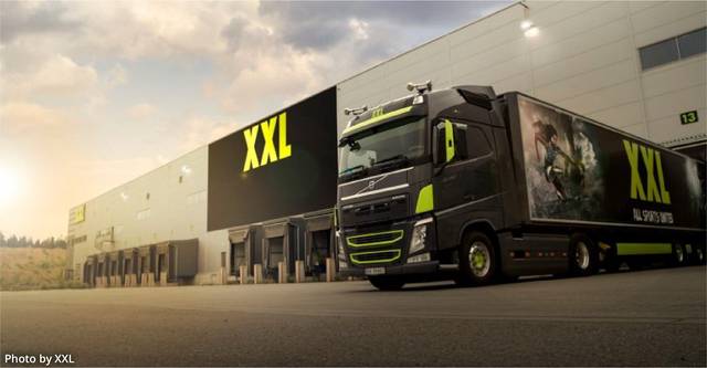

XXL is a leading sports retail chain in the Nordic region, known for its extensive selection of sports equipment, clothing, and leisure products. Founded in Norway in 2000, it has since expanded to Sweden and Finland. By combining traditional retail with a robust online presence, XXL attracts a wide range of customers. Their business model focuses on high volume and low margins, offering quality products at affordable prices, which, along with strong customer service, has positioned XXL as a market leader in the sports and leisure segment.
XXL was in the process of evaluating its in-store signage system. Displayed posters and signs in the stores lacked structure and consistency. Design decisions were based on subjective opinions, resulting in different designs in each store and a lack of a cohesive experience.
XXL wanted to better understand the significance of signage and make design decisions based on data. Rather than simply inventing new "nice" concepts, they wanted to be data driven in the process. The end goal was to effectively guide and inform customers, while ensuring that promotions and news received attention. A key challenge was to avoid giving customers a chaotic visual impression that might subconsciously filter out the store's intended messages.
Eidra, with CRO experts from Conversionista and designers from Heydays, was involved in developing a new signage concept applying a data-driven approach.
To gain the best possible understanding of how customers interact with signs in the physical store, we used eye-tracking technology. With this insight, combined with user tests and design principles, we were able to develop a new signage design.
The project consisted of:
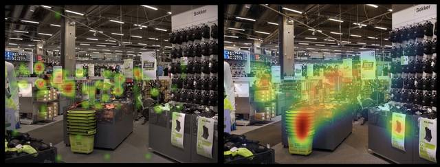
Using advanced glasses that record video and track eye movements, we gained direct insight into what customers look at as they navigate the store. We had 20 participants wear the glasses while they shopped, with the simple instruction: "Walk around the store as you normally would."
This test revealed what captured customers' attention and identified which products, displays, and areas of the store were most appealing.
Collecting data on eye movement helps us make informed decisions on how to improve the customer experience and enhance the effectiveness of signage.
Following the eye-tracking tests, participants were interviewed about what they remembered about the signage and whether they had bought more or less than they intended. We also interviewed customers in various departments who had not participated in the test to gather insights about their experience and what they noticed or overlooked.
In addition to this we interviewed store employees, revealing that the signage was not effectively aiding navigation. Employees indicated they spent too much time guiding customers around the store, detracting from other important tasks.
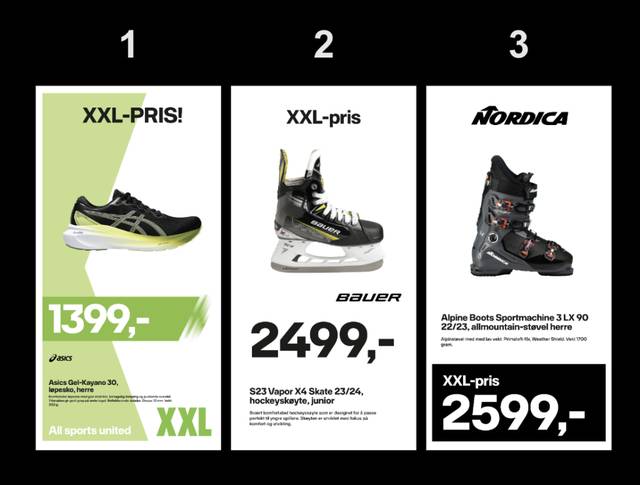
To gather insights on readability and first impressions of signage, we conducted a "1-second" test where participants viewed different sign designs for just one second. The signs were designed based on different hypotheses.
Here's how we did it:
Customer insights from the tests and interviews enabled us to identify elements and visual strategies that affect readability and first impressions.
The results of all tests were thoroughly analyzed and documented to give Heydays the best foundation for creating new designs. This data-based approach provided essential insights, including:
Based on the insights from tests and interviews, designers developed various proposals for new signage designs. We worked on both the visual elements and the information hierarchy, providing ideas for further development of price signs. This process combined aesthetic appeal with functionality.
We collaborated closely with XXL throughout the process, holding ongoing discussions about the different proposals. The data revealed that color contrasts played a significant role.
Another key finding was that customers largely navigate using the products themselves. Working with such data-driven insights provided a much greater sense of confidence and security in tackling the task of improving signage.


The result of the project is a new signage design which is being rolled out in all XXL stores in 2024. Before rollout the design has been further validated through in-store interviews. Through the project XXL has gained valuable insights into the physical customer journey in terms of placement of signs, information architecture of signs and the loyalty program.
Ready to accelerate your digital growth? Add your details here or email us at hej[a]conversionista.se and we’ll get back to you.
