

C'est normal is a community-driven Swedish lifestyle and clothing brand for men, founded in 2018. Based in Stockholm with a global e-commerce presence, the brand’s name - meaning “it’s normal” in French - reflects its core message: there is no single definition of normality. C'est Normal encourages customers to be themselves and confidently go their own way, believing that self-assurance is the foundation for creativity and the power to challenge established norms. The brand offers minimalist, adaptable, and comfortable apparel and accessories, and maintains a strong online presence through its website and social media channels.
With a shift in business strategy, c’est normal is moving beyond its roots as an influencer-driven brand. The focus now? Letting the brand itself take center stage and communicate its core values directly to customers.
After recently optimizing their organization, platform, and product offering, c’est normal set their sights on the next big step: creating an even better customer and shopping experience.
To identify conversion pain points, leaks, and opportunities, they brought in Conversionista for a conversion review – a comprehensive, data-driven analysis of their website using triangulated insights from multiple data sources.
Our approach to CRO is rooted in a simple rule: conversion happens when your and your visitors’ goals meet. That’s why the review is designed to help you meet the goals of both your business and users.
During a conversion review, we dive into a detailed funnel analysis to map out the customer journey - from the moment someone lands on your site to the final purchase. This lets us clearly see where users are dropping off at each step, so we can focus on the main leakage areas. The big idea? Find ways to increase motivation in the early funnel steps and reduce friction in the later steps. In other words, make it easier for users to get started and keep them moving smoothly all the way to checkout.
To do this, a conversion review focuses on six key questions every user asks - sometimes out loud, sometimes just in their head - when they visit your site:
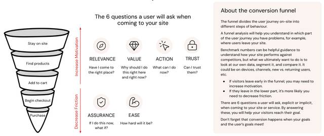
Image taken from our free CRO Playbook, which is available by request.
But how do you actually pinpoint where users get stuck or drop off? That’s where data triangulation comes in. A conversion review combines:
Quantitative data: Answers HOW and WHAT is happening (think: web analytics, business data). This shows where users drop off and how often.
Qualitative data: Answers WHY it’s happening (think: surveys, usability testing). This reveals the motivations and pain points behind user behavior.
Heuristic evaluation: Reviews the website’s UX/UI using best practices and experience from thousands of projects to spot visible issues and refine the user experience.
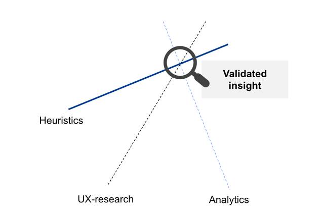
By triangulating these data sources, the review doesn’t just validate insights - it uncovers new opportunities and pain points that a single data source might miss. This approach of evaluating a website's performance ensures suggestions for improvements are based on data-driven insights and a deep understanding of the customer journey - increasing both the user experience and conversion.
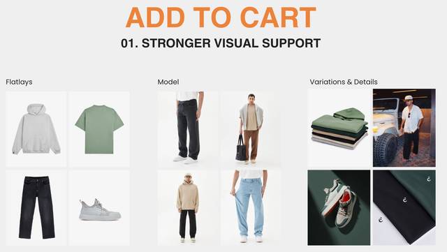
The analysis uncovered the main leakage areas and delivered 59 actionable insights, ranging from quick wins to experimentation candidates and areas for deeper exploration. Here’s what the results consisted of:
Our deep dive revealed several high-impact opportunities to boost motivation, reduce friction, and create a smoother customer journey, insights that can inspire your own optimization efforts. To highlight the most valuable takeaways, we asked Warner Nickerson, CEO of c’est normal, to share his top personal favorite findings:
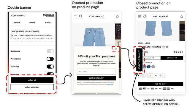
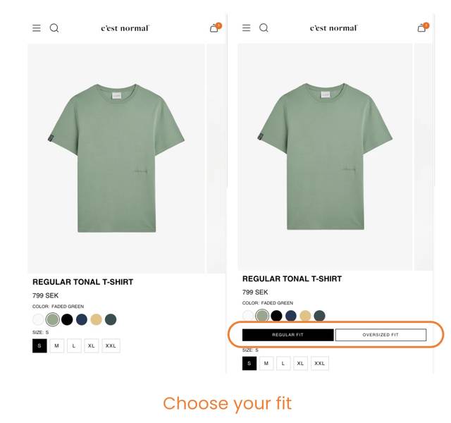
Gain access to our CRO Playbook, containing guidelines, examples, and instructions for getting started with CRO, perfect for anyone looking to take their first steps towards optimizing their website. Get your free beginner’s guide to CRO by sending us an e-mail: hej[at]conversionista.se
One month after c’est normal began implementing the changes, they’ve already seen promising results. When comparing the data from before and after the updates, website traffic has increased, while the conversion rate has remained steady. That’s a strong start, especially since more traffic often brings the risk of attracting less relevant visitors. In c’est normal’s case, though, this growth led to a 31% increase in conversions while comparing absolute numbers between the periods.
With many recommendations still left to act on, the path to even greater growth is looking bright.
“I am extremely grateful for your efforts in putting this together. This is excellent, actionable work that we can move forward with. We have scheduled a meeting
after lunch to begin implementing the actions today”
– Björn Påhlman Spenger, Founder & CEO, Fashion Tech Group

Curious about what’s holding your conversions back? Reach out!
Ready to accelerate your digital growth? Add your details here or email us at hej[a]conversionista.se and we’ll get back to you.
