We have been working on improving conversion for Sweden's e-retailers for over ten years. After a while, you see recurring questions and A/B tests that deliver quite consistent and predictable results.
If you have an idea or hypothesis that is very likely to deliver (and has done so repeatedly) - that's what we call "best practice." If we see the potential in a new customer, we say:
– You should test this, we've done it many times before, and it usually delivers.
If there are such "best practices," then almost everyone should have already adopted them?! Unfortunately, we often see that e-retailers do not actually follow the principles. But instead of just randomly complaining about CRO, we decided to take the temperature of Swedish e-commerce to see how many follow best practices and how many have missed them.
You can find the full results here.
To begin with, you might ask where in a webshop there is the greatest potential for improvement and positive A/B tests? Here we usually talk about test elasticity. When you test in certain places, very little happens no matter what you try to do. There is no elasticity. But in other places, things happen, both positive and negative, when you test. Then you have found elasticity.
Generally speaking, the page in a webshop with the most potential is the product page. This is where the customer makes their purchase decision - whether they want the product or not. Is it the right color, is it the right size, is it the right price? Questions answered here.
Another page with potential is, of course, the checkout. This is where the customer has to commit and actually pay for the purchase.
So we chose two so-called best practices for the product page and the checkout for our survey.
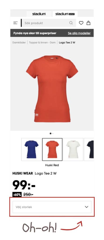
Dropdown lists are a common way to present choices when there are many options to choose from. The advantage of dropdown lists is that they don't take up a lot of space before you need to make a choice, or for those who don't need to choose at all. That's why this type of list has been standard since the first web browsers came out.
But dropdown lists also have a major disadvantage – namely that they hide the information in the list, and you have to click on the list to see what's there. This can be very frustrating on a product page when using drop downs to show different sizes. Then the visitor has to open the list with an extra click to see which sizes are available. This report from Baymard Institute shows that visitors feel they are wasting time when looking for products only to find that they are not available in their size or color.
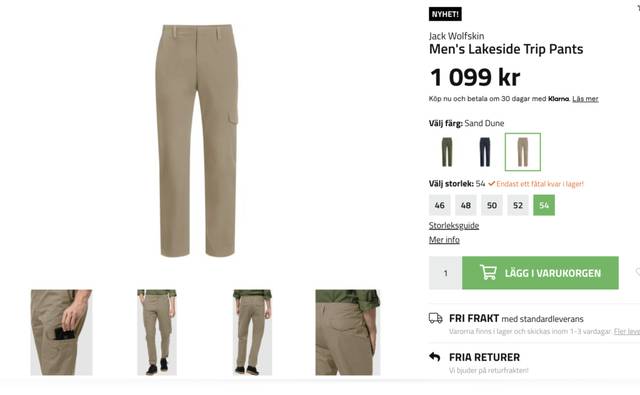
It's quite simple, actually. You show the sizes as buttons instead. Then you can choose a filled button or a clear color for available sizes and a slightly grayed-out/weaker color for unavailable sizes. This makes it easy for the customer to immediately see which sizes are available for a particular product. Outnorth has figured out how to do it.
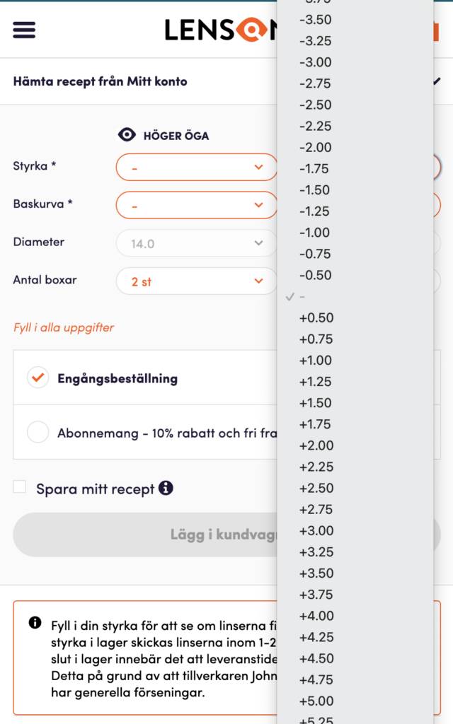
When looking at "best practices," it's important to keep a clear head. A rule of thumb applies most of the time, but not always. So are there times when you should actually have a dropdown? Yes, if you have a lot of options. Think about how Lenson would look if they had buttons instead?
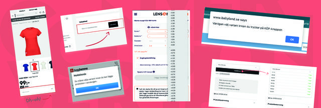
Have you ever received an error message that says: "You must choose a size!" Thought so. Did it feel good? Not particularly, right?!
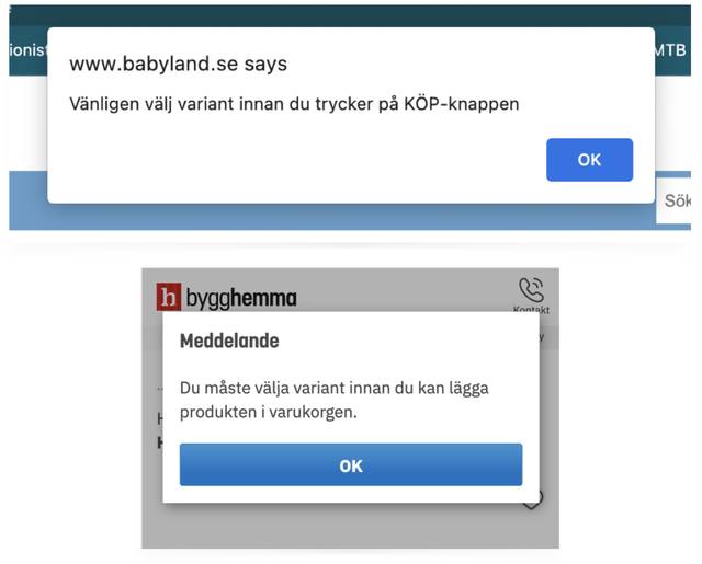
Missing to choose a size before we click "add to cart" is a fairly common mistake we make. And then we often get that little reprimand that says we haven't followed the rules in this fine webshop. But is it really necessary?
One solution that many choose is to have a default option. If you don't make an active choice yourself, you get size medium. It may seem simple and practical, but unfortunately, not everyone is size medium, and when the package arrives, there is a high risk that it will be returned, and what do we think about returns? Not good.
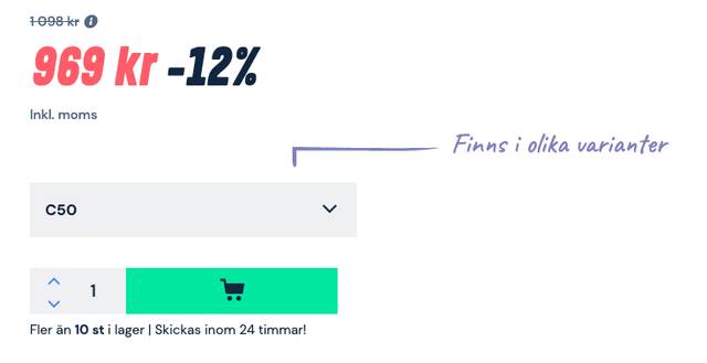
Another problem with this type of method is that the customer doesn't understand that there are multiple sizes. Then you can do like Proffsmagasinet and show it with an arrow. But we generally say that if your site is not intuitive so that you have to fill it with manuals on how to use it, then it might be better to go back and redesign the experience from scratch.
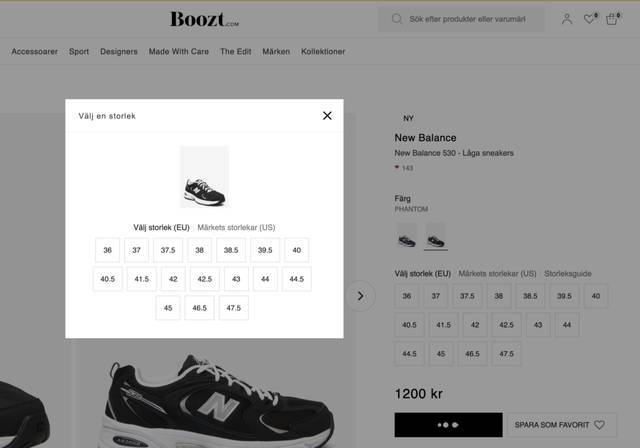
Instead of slapping someone on the wrist, we can simply show the size choices again in a new way – like a modal/pop-up, for example. Then the customer thinks, "Oh, this is where you choose the size, yes, that works." And then they can make their choice and move on.
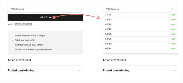
Take, for example, Cellbes; they have size selection in a dropdown (we don't like that 😟), but if you happen to click on buy without choosing a size, the size list simply expands. It doesn't have to be that difficult.
We can simply have several different ways to choose a size, and depending on how careful, careless, methodical, or stressed the customer is, they will find a way that suits them.
3. Don't Show an Open Discount Code Field in the Checkout
Discounts are good for driving sales, right? Both yes and no, we say. When you offer the possibility of a discount in the checkout, two things can happen.
To find out which of these factors is stronger, we did an A/B test with one of our clients. In the variant, we simply removed the discount code field entirely. This led to a 7% HIGHER conversion rate. Even though some customers couldn't enter their discount code, this was compensated by the effect of people staying on the site instead of searching for codes elsewhere.
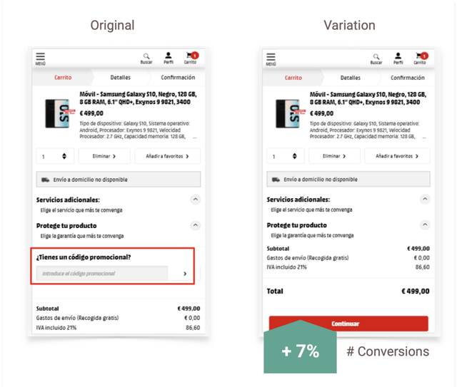
As with all A/B tests, this doesn't mean that what worked for this site will work exactly the same for you. But there are compromises. It's about finding a middle ground that allows those who really have a code to find a way to enter it without simultaneously distracting those who hadn't even thought about having a code.
The problem with an open/visible discount code field is that it says to us: "Hey, I'm empty, fill something in here." In UX language, this is called "affordance." If we can just hide the field itself, it won't "speak" to us in the same way.
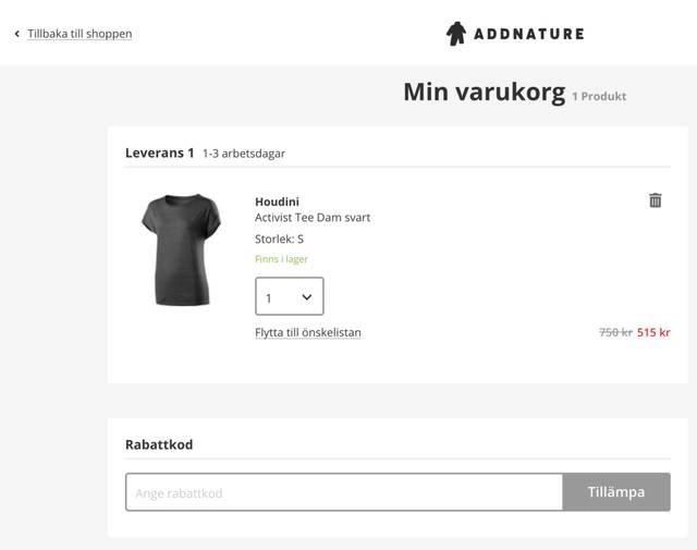
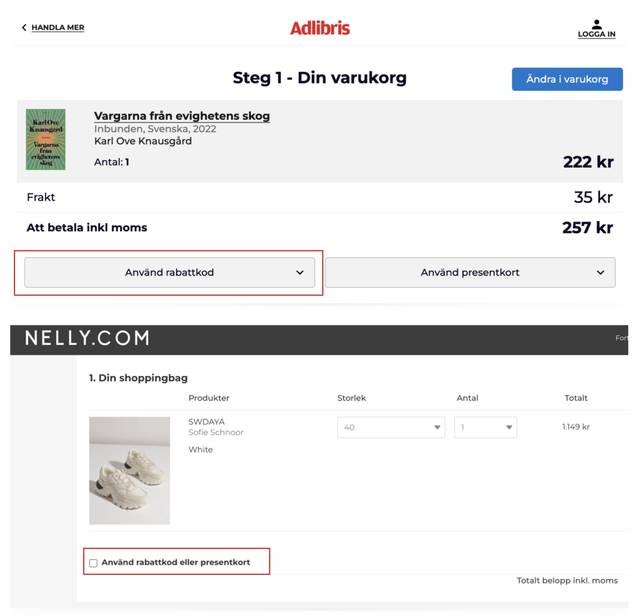
Here are some examples of how to hide the field under an extra click but still keep the function for those who are really looking for it.
We took the list of the 100 largest e-retailers from ehandel.se and evaluated them based on our three best practices.
If you thought we were a bit picky and complaining at the beginning, thinking that Swedish e-retailers haven't come very far with their conversion optimization, **our survey shows that we were actually quite right.** Only four of the hundred largest Swedish retailers managed to hit all three.
Top Four 🎉
- Babyshop.se
- Engelsons.se
- Gudrunsjoden.com
- Stronger.se
You can find the full results here.
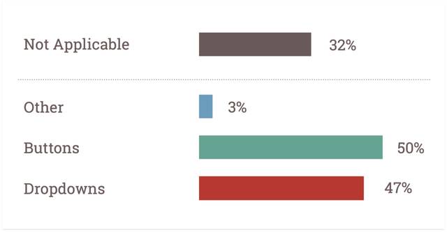
Here it was quite even between those who followed best practice (buttons) and those who still had dropdowns. To begin with, there were 32 e-retailers where the criterion was not applicable (they don't have sizes). Of the remaining, 50% had buttons and 47% had dropdowns. 3% had another method.
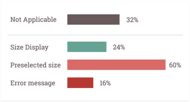
When it comes to how to handle customers who forgot to choose a size, we unfortunately got a slightly worse result. Here too, there were some retailers where the criterion was not applicable.
Among the remaining, the most common method was to have a default size selection. That is, if the customer doesn't choose a size themselves, they get the most common size automatically. 60% did this, 16% showed an error message, and 24% displayed a new size selection to help the customer choose.
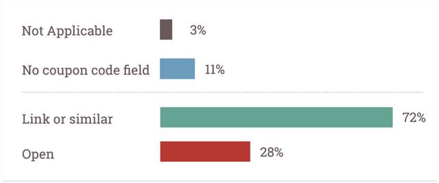
Here we found that most e-retailers have a discount code in some way - 86 out of 100. Here it is encouraging that most of them follow best practice. A full 72% of those who offer a discount code have "hidden" the discount code field under a link or something similar.
We know it's tough for e-retailers. For many, it's blood, sweat, and tears every day. We feel your pain. Therefore, we hope this article can serve as some kind of inspiration. There are not just one but several conversion leaks to plug. Most things are still undone - so it can only get better.