Funnels or conversion funnels or purchase flows or whatever you want to call them are beloved in the conversion world. And there are as many opinions on how they should be created as there are conversion nerds. So how do you know what the right choice is for you? (Spoiler – Netflix has the answer)
In this blog post, we look at one of the world's most effective flows, at A/B tests that we at Conversionista have done, and of course, at some cautionary examples. All to create insights (as opposed to opinions) on how an effective conversion flow works. Let's dive in.
A “truth” that held in the e-commerce world for a while was that you should have a “one-page checkout” - it converts best. Period. After looking around at the larger Swedish e-retailers, I conclude that this is no longer the case. Above all, Klarna checkout has redrawn the map, and many build their checkout experience around that product.
If you buy into the concept of a one-page checkout, it means you believe in the theory that “shortest is always best.” But is that really the case? Could it be that a longer flow, with more steps, is actually better in some cases? And how can that be?
Imagine you are a bit interested in a new car and walk into the dealership on a nice Saturday afternoon. The car salesman sees you as soon as you walk in the door, and already when you reach the first car, he steps forward with the order pad ready in hand and says, -“I thought it would be best to be ready if the moment is right. What do you say - should we go for it?”
Neither you nor I, nor anyone else for that matter, would go for it at this stage. When a consumer has too little information to make a decision, they make the decision to say – no! This is especially true if the cost or risk is high if we happen to make the wrong purchase decision. It’s not the end of the world to buy the wrong chewing gum once, but it can be a bit more troublesome to buy a car that turns out to be crashed and has to be scrapped.
The conclusion of this story is that the best purchase flow is the one that gives your customer exactly the information they need to make the right purchase decision without being a single step longer than that. And it’s not always the shortest path to the buy button.
"The best purchase flow is the one that gives your customer exactly the information they need to make the right purchase decision"
The trouble with this no-decision is that it can become more final or permanent than we might think.
When the customer has said no to us once, we end up in the category, “sites or services that I have said no to for some reason that I now don’t remember.”
Maybe it was just some uncertainty about a product or an add-on or some condition? It shouldn’t be a big deal to come back and clear it up and then proceed to complete the purchase, right? But now our ability to post-rationalize and what is called misattribution comes into play. The customer simply doesn’t remember what the reason was and now makes up reasons like – “They were probably too expensive. I don’t like them. I think I heard they weren’t that good.” Explanations that are completely normal and very easy for the customer to believe because they place the blame on us and not on the customer themselves.
The conclusion is that when we have managed to get the customer to say no to us once, it is very difficult for us to work our way back to becoming a viable option again.
"When the customer has said 'no' once, it is difficult to get them to change to 'yes' later"
So if you have too many customers saying no to you today, the solution might be to slow down the customer, to introduce more steps so that the customer understands your service better when you finally ask the question – “What do you say, should we go for it?”
A big reason I’m writing this blog post is that I happened to end up in Netflix’s new signup flow. I was surprised and inspired by what I saw and felt I wanted to share my insights. Netflix is a company that tests a lot, so if we see something they have rolled out, we can trust that it is tested and validated. So what do they do?
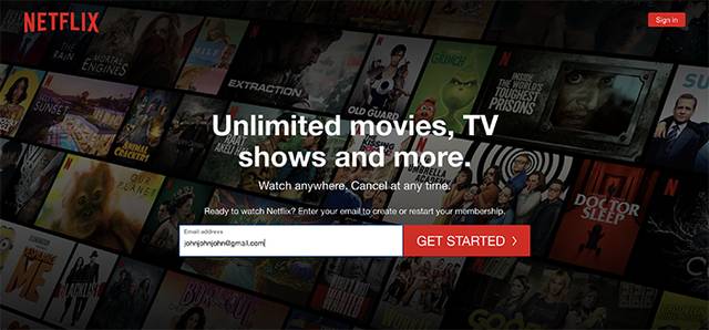
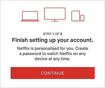
The first page is pretty basic & by the book; you enter your email address and then move on to the second step in the flow. But now comes the first surprise. You don’t go to the page where you choose a password but to an “intermediary page” that informs you that the next step you will take is to choose your password.
The same thing is repeated when you move on to choose your subscription. First, you come to an “intermediary page” that lets you know that on the next page – you will choose your subscription type. And here we see three messages: that you can cancel anytime, that everything on Netflix is included, and that you can watch on multiple devices. Since Netflix has forced me to pause here, I think they have seen in their experiments and data that customers who really understand these three points are more likely to convert later. And that’s why they now have this new, longer flow?!
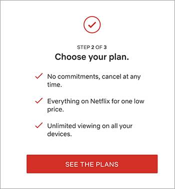
Here we really see proof that the shortest flow is not the best flow. If you have something you really need to tell visitors for them to become customers, make sure to give ample time and space for those messages, even if it makes your flow longer.
I have previously written about the two main principles for increasing conversion – increasing motivation or reducing friction.
I have been involved in quite a few projects where the goal was to increase conversion in purchase flows, and often the focus is on reducing friction. We should remove unnecessary fields, remove unnecessary steps, make it easier to fill in the fields, etc. A dialogue I had in a project here in Australia made me question this.
The client had heard from their customers and customer service that there were many complaints about the form fields being difficult to fill in and the flow being hard to get through. Everyone on the client’s team agreed. It was an internal truth that if they just made the flow easier, sales would increase. And sure, it was a rather cumbersome flow with six steps to buy a new insurance policy. But I wondered if that was the biggest problem?
This particular client sells insurance as an add-on product. Their USP is that if you buy their insurance, you earn points in the company’s bonus program all the time. Imagine buying insurance and every time you pay, you earn points in MedMera, ICA, SAS Eurobonus, or wherever you are a member. As for the price, they are not particularly competitive; they are higher in price than their competitors. BUT - almost no competitors have the advantage of being able to collect bonus points, so it’s really important that this point gets across.
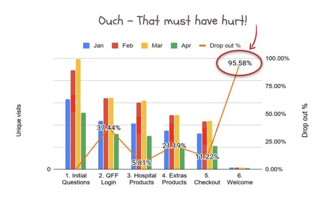
When I looked at data from their funnel, I saw that most drop-offs were on the last page. If the flow is so problematic, it means that only the most motivated visitors get there. And here they finally give up. My analysis is that: if you manage to get all the way to the end but still don’t buy, it must be because the visitor hasn’t perceived the value of the product. – “Too expensive in relation to what I get”. My recommendation to the client was not to make the flow easier/shorter but rather to slow down the customer in the flow and focus on the value of the bonus program.
So far, we have reasoned as if there is one funnel that all visitors should follow. But that doesn't have to be the case. You can have different funnels for different visitors. Here again, Netflix is a great example.
If I try to create a new account with an email address that is already registered with Netflix, I am welcomed back and asked to enter my password. The most common thing that happens on other sites is that you get an error message (You did something wrong) and are told to go to another page to fix it. Well done, Netflix.
Have you ever gone through an entire flow, something happens, and swoosh, you’re back on the homepage – and all the forms are empty? Thought so. How did it feel? Did you want to strangle someone?
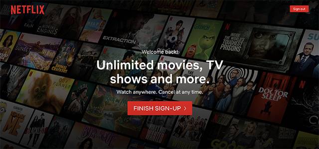
Netflix does the exact opposite. If you come back, they remember everything you filled in. They say “finish sign-up,” and if you click the button, you return to the step in the process where you left off. Good job again, Netflix.
In one of our most popular, we had a problem with many visitors dropping off on the form page. When we asked what they wanted to do on the page (in an “Exit intent popup”), about half of the visitors said they came to “get more information.” But they were on a form page to buy the product. So they had come to the wrong page! The form wasn’t the problem; it was a symptom that we had taken the visitor to the wrong page.
Since we tried to convert visitors who didn’t have enough information, the obvious solution was to create an additional flow for visitors who weren’t ready to buy yet.
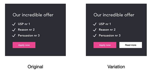
Not exactly rocket science to add a “read more” button, you think. But I disagree. It’s a bit of rocket science. Not adding the button. But the process and method that led to the insight and the hypothesis, and not least the result of the A/B test that showed that this little button was worth more than 1 million SEK annually.
The final point here is that you can take visitors to different funnels and to different starting points in your funnels to make their experience as simple and effective as possible.
The boring answer here is the classic “it depends.” Every situation is unique. But hopefully, we have managed to give you some inspiration and concrete examples that you can test on your site. Because theories and analyses are great, but the only thing that has a positive impact on your business is a new design principle that you have tested, validated, and successfully implemented in your business.
The length and structure of your funnel should be tailored to your specific business needs and the behavior of your users. There is no one-size-fits-all solution, and what works for one company may not work for another. The key is to understand your users, test different approaches, and use data to inform your decisions.
Here are some key takeaways to consider when designing your funnel:
By following these principles and continuously testing and optimizing your funnel, you can create a more effective and user-friendly experience that drives conversions and builds long-term customer relationships.
Happy funneling!