It's easy to get a bit work-damaged when you work with conversion optimization because once you start thinking CRO, it's a bit hard to turn off that function in your brain even when you're off duty.
We simply optimize what can be optimized.
And that's why we often encounter conversion killers when we browse the internet privately.
It usually causes quite a bit of frustration because most are honestly "easy fixes" (which probably cost a lot in lost conversion rates and revenue for the companies in question).
It shouldn't have to be that way.
Isn't it a bit tiresome that this is still everyday life on the internet in 2018?
To avoid this becoming a frustrated rant about how bad many are at optimizing the functionality of their websites, we thought we'd throw in some practical suggestions for "just do it" changes that can dramatically increase your conversion rate.
Then it's obviously up to you whether you want to try it or not (Tip – at least A/B test before letting the brand police convince you otherwise).
It wasn't long ago that we ranted about how important it is to use clear contrast when designing your CTAs.
With the lesson on how quickly our brains process and rationalize the content on a page, it's not hard to understand that we need to design web pages where the visitor can clearly see what they are expected to do next.
With that knowledge, it's surprising how often we find ourselves desperately scanning a page for a CTA, only to realize it has been within our field of vision the entire time.
One of the worst culprits?
*cue dramatic music*
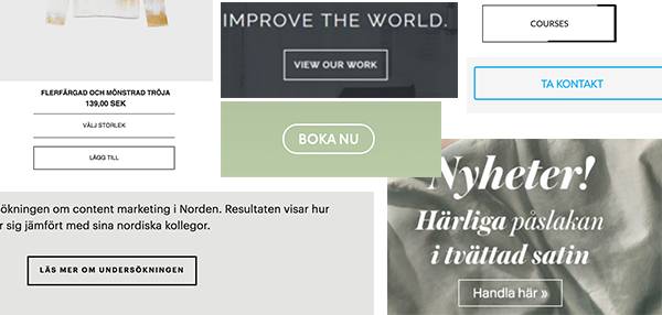
Ghost buttons.
Angie Schottmuller (the CRO star behind our contrast model for CTAs) managed to concretize what we all think:
"Ghost buttons drive me crazy. It goes against usability. The concept is a designer’s fantasy trend that should die. The only time I find this tactic useful is when a client insists on having two CTAs on the page, and I basically want one to disappear. Ghosted buttons have ghost conversions."
So, as Angie says, ghost buttons serve their function: as a secondary CTA that can indicate a certain level of visual hierarchy to the user.
But sure, if you want to make it harder for a user who is about to convert? Be our guest.
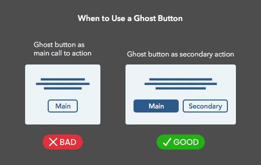
Photo:UX-movement
Like above. Visitors to your site shouldn't have to search.
It's likely that your visitors land on your site with a mission in mind - serve the solution to their problem/question on a silver platter.
Not hidden far down the page.
We usually say that people don't know how to scroll.
Of course, they do, but you should assume that most are too lazy to use that knowledge (we've looked at quite a few scroll maps in our days, so trust us on this one?).
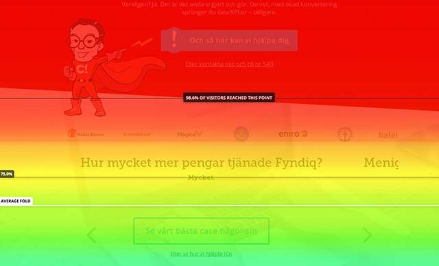
So it's downright stupid to place your proposed action somewhere where the majority won't even see it, right?
That said - people also tend to have a common pattern when scanning the content on a page, maybe you're familiar with these models already?
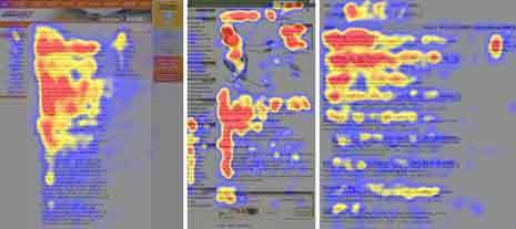
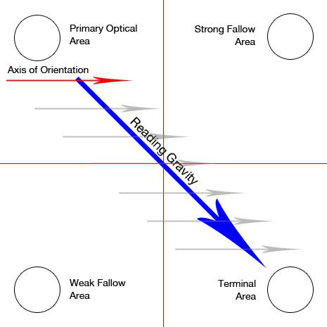
We tend to scan a page in an F or Z pattern.
This means there are "blind spots" even above the fold - by placing content strategically, you can make it easier for your visitors to find what they are probably looking for (remember, conversion optimization is not about tricking, but about serving visitors what made them land on your page in the first place).
There are few things as discouraging as being met by a "wall of text" when landing on a page.
Whitespace and formatting are good things that make the task of figuring out what a page is about a bit more manageable.

Poor contrast is another pet peeve when it comes to making a page easy to process.
Our colleague Adam recently found this prime example of questionable color and contrast choice (which probably deserves some sort of prize in bad UX?)
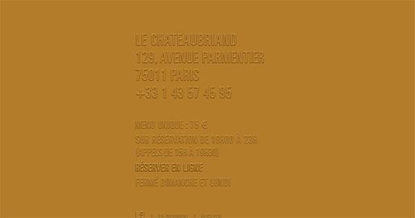
Not so hard to avoid such an extreme example maybe, but even more traditional fonts and color schemes can be a problem when it comes to a page's readability.
Check your color choices in this tool and read more about how to succeed with typography on your website in this blog post.
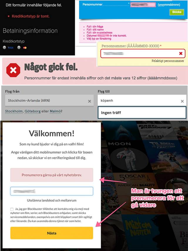
"The personal number is incorrect", "Fill in the date", "phone number is missing"...
When you've tried to fill out a form for the 8th time and it still shows the same stubborn error message, despite trying every possible combination of dd-mm-yy, a certain frustration arises.
It's surprisingly common with forms that don't even give a hint about which combination is correct, but instead seem to find some form of enjoyment in letting the poor user tear their hair out in desperation.
If you care about retaining the visitors who have decided to convert, don't mess it up with something like that for heaven's sake.
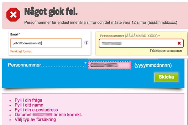
And yes, sometimes things go wrong, but how about instead of banning the potential customer in question, encourage them to fill in the correct values and complete the form?
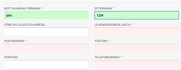
A form that gave positive indications increased the conversion rate by 13% for one of our clients.
No one has the patience to wait for your flashy slider or nicely edited video to load on the homepage, that's just the way it is.
This graph nicely describes the correlation between poor load time & bounce rate on a page:
The uncertainty is great when shopping online.
"What will the product look like in reality? Will it even be shipped or will they steal my card details and sell them to the highest bidder online?"
It's not so strange to be worried about such things when you neither have a face on the seller nor have seen the product in reality.
It's your job to erase these question marks.
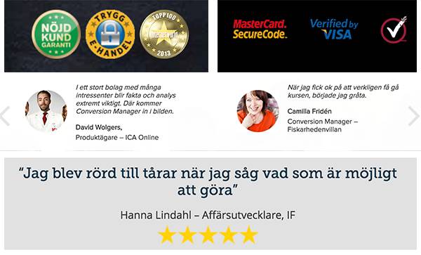
Radiate social proof and trust to your potential customers with reviews, partner logos, and a website that exudes trust - not shady internet criminal.
Do you promise something in your emails/ads? Then keep that promise throughout the customer journey and don't lose the thread halfway through.
Even if it seems obvious to you, it's important to be overly clear in all communication.
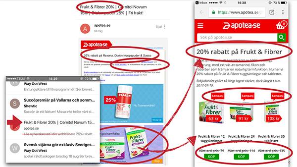
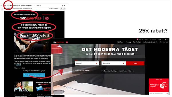
There are few things as nerve-wracking as landing on a page that didn't meet the painted expectations at all.
We talk a lot about how to "keep the scent" in this blog post.
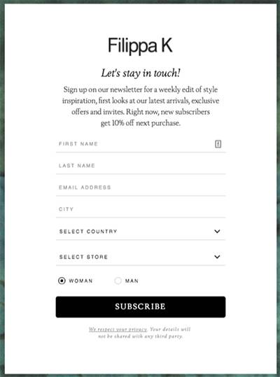
7 fields to get a newsletter? Really?
Consider what you are asking from the visitor - versus what value you are actually offering in return.
Are you providing a quote for home insurance? Sure, then both personal number & address are quite necessary, but you hardly need a phone number and full name for a newsletter?
Hubspot's data on form fields vs. conversion rate looks like this:
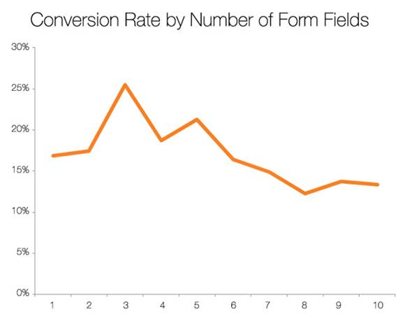
That said, you can't assume that all forms and landing pages are created equal, fewer fields in the form don't automatically mean a higher conversion rate.
BUT, if you insist on using 7 fields to capture email for a newsletter list, it places higher demands on the design of the form overall - Read more about how to create a form that actually converts here.
Hallelujah!
The visitor has decided to make a purchase, adds the item to the cart, and eagerly clicks the checkout button.
But that's where the fun ends.
The free shipping that was promised earlier is nowhere to be found.
You require them to log in or create an account to complete the purchase, and at checkout, it becomes clear that invoice payment is not an option.
The visitor feels anything but secure about handing over their card details (should have worked more on trust and social proof after all!) and slams the laptop shut in frustration instead.
Don't mess up the customer if they have decided to make a purchase, instead work on reducing friction in the checkout and payment process, and if you promise "free shipping," keep that promise.
That was a small selection of the trends we often encounter online, but we are convinced that we have only scratched the surface here...
What is the worst conversion killer you have encountered?
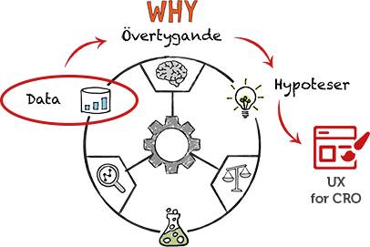
But maybe you don't really know how the site should look to succeed with that?
There are still spots left for our UX training on April 10.