Photo credit: www.devold.com

Photo credit: www.devold.com
With 170+ years of experience, Devold of Norway is today a leading merino wool outdoor brand, dedicated to mastering the production of exclusive wool with a focus on sustainability, natural materials and ethical production.
They were facing significant sales leaks due to poor user experience on their checkout page, which they could no longer afford. The challenge was to identify and fix the current issues quickly and efficiently, ensuring that the existing page could perform optimally and increase conversions, without waiting for the complete redesign.
We started with a deep dive into Devold's checkout process through a Conversion Review Conversionista had previously completed for Devold in 2021. We also conducted a new heuristic analysis of the website, and a usability test of the user journey to understand real user pain points in the funnel. This resulted in the discovery of critical pain points that were hurting both the user experience as well as conversions.
By focusing on easy wins with the highest impact on conversion, we decided to tackle the most impactful pain points first. We made small data-driven design tweaks that required minimal development work.
This efficient approach promoting frequent communication and iterative development allowed us to roll out 18 design changes in just six weeks.
We incorporated an agile way of working in our cross functional team, allowing the team to quickly respond to -and receive feedback to changes. By breaking the project into smaller, manageable tasks and iterations, the team could produce high-quality design and development at high speed. Obstacles were more manageable when breaking down the tasks. This enabled us to utilize minimum development resources and ensure the project remained efficient and cost-effective.
As we had many low hanging fruits with high impact in the prioritized backlog, the agile way of working was a perfect fit for this project.
As part of our implementation strategy, we set up robust tracking mechanisms to gather valuable user insights, ensuring we had a clear understanding of user behavior and pain points. Additionally, we established a solid foundation for reporting on key performance indicators (KPIs), which allowed us to monitor progress and measure the impact of our design adjustments. This comprehensive approach enabled us to make data-driven decisions and continuously optimize the user experience, ultimately boosting profitability and conversion rates.
To support Unfold's redesign for Devold, we conducted a Conversion Rate Optimization (CRO) review of Unfold’s new sketches. Our goal was to provide helpful CRO and SEO advisory inputs, ensuring that the new design aligned with Devold's business objectives. By collaborating with Unfold, we aimed to enhance their creative vision with insights that could improve performance and user experience before the handover.

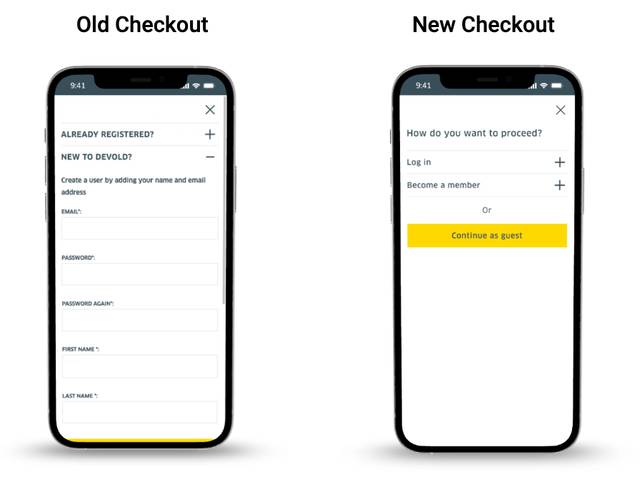
Old vs. new checkout
Within just one month of implementing the initial 18 design changes, we measured a remarkable 73% uplift in conversion rates in the checkout process. This impressive result was achieved compared to the same month the previous year, even though this year's traffic was much lower.
The quick and well-thought-out design adjustments not only reduced sales losses but also significantly boosted profitability ahead of the new website design. The impact of our strategic implementation for Devold was both significant and quick.
We achieved this by breaking down silos, maintaining efficient communication between all the companies involved, and creating a collaborative environment where everyone was aligned and working towards the same objectives. Additionally, we established robust tracking systems, providing a strong foundation for ongoing user insights and performance reporting. Following the success of the first release, another 22 design changes were implemented, further enhancing the user experience and driving continued improvements.
Ready to accelerate your digital growth? Add your details here or email us at hej[a]conversionista.se and we’ll get back to you.
