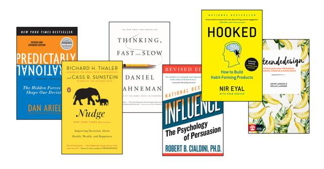
For us at Conversionista, behavioral design means designing something, in various contexts, to achieve a positive behavioral change in the users of the product/service/site. Perhaps the most exciting aspect of behavioral design is its close connection to behavioral science and behavioral economics. For those who want to learn more, there is plenty of literature with tons of scientific studies on the brain, decision-making, and behavior change. The most famous example is probably the bestseller 'Thinking Fast and Slow' from 2011, written by Nobel laureate in economics, Daniel Kahneman. But even in little Sweden, there is good literature on the subject, where we can recommend the book 'Beteendedesign' by Arvid Janson and Niklas Laninge.
Behavior change is by no means an online or CRO-specific phenomenon, and as mentioned above, it can be applied in many different contexts. Even though we humans know that, for example, it is good to take the stairs instead of the escalator, we are lazy and find it difficult to motivate ourselves to choose the stairs when faced with the choice.
Sometimes (read: often), a push, a nudge, from us designers is needed for our users to choose the good behavior over the bad one. Take a look at this fantastic example of piano stairs at Odenplan's subway station, which increased the number of people who choose the stairs by 66%.

Scarcity, confirmation bias, social proof, Hobson's +1 effect, and so on. There are many principles and techniques for nudging. So, what is it about then? Simply learning as many principles as possible and then wildly applying them where you feel it is appropriate? No.
To understand which principle you should apply in a given situation, you need to understand the current behavior, usually by analyzing both qualitative and quantitative data. For the behavior change to occur, you need to create an accurate hypothesis based on data. Let's use this very simple, behavioral design-adapted hypothesis formula:
And of course: a fictional example, let's say from a large airline, where users have 15 minutes to complete the purchase from the moment they have chosen a ticket and clicked on "Start purchase"
If you know that you can change people's behavior through 'nudging' - take that responsibility seriously. If you pretend in your e-commerce that you have fewer products in stock than you actually have to create a sense of urgency, you are on the wrong track, and it risks backfiring in the long run. But where is the line? It is, of course, subjective, and not something I will delve into in this post.
But if you want to read more about responsibility and empathy for the user, check out this blog post: Create Positive Impact Through Empathetic Behavioral Design
However, I want to point out that there is quite an interesting discussion in various places around the world, where giants like Facebook, Instagram, YouTube, etc., receive sharp criticism from within for their so-called behavior monsters. If we look at Instagram and Facebook's feeds as examples, you might realize that "scrolling up at the top of the screen to update the feed" is quite similar to classic slot machines at the local pizzeria. Pull the lever, and maybe you'll be happy and get an endorphin kick - more often than not, you are left with no value in all mentioned cases (the writer's personal opinion).
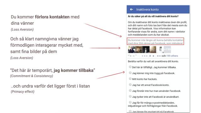
The most common principles out there originate from Cialdini's behavioral design bible 'Influence', and you don't have to look closely to find many of Cialdini's principles everywhere on sites like Booking, Facebook, and many, many others. The principles are both well-known and proven to evoke a, often for the company, positive behavior. What do you think about Facebook's use of behavioral principles to get you to cancel the deactivation of your account?
When you want to create a product that builds a behavior that eventually becomes a habit, it is not uncommon to create an app. You want your users to return to this app, and you often optimize based on other metrics than bounce rate, add to cart, etc. Now we are talking about, for example, retention, churn, and monthly active users.
When creating A/B tests with the goal of creating recurring users (instead of increasing conversion, for example), it is important to be precise.
It is logical that behavioral design plays a big part in this as well. A habit is a behavior, and by creating a user experience that makes people habitually open your app for, for example, a daily dose of endorphins, "staying updated," or just to pass the time (since you obviously can't afford to spend a minute on the subway looking out the window) - then you have succeeded with your behavioral design.
A very good model to describe how a habit is created is 'The Hooked Model,' created by Nir Eyal, and well described in the book Hooked.
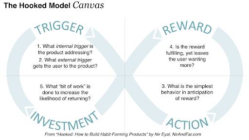
Without going too deep into this model, I can happily refer you to the language app Duolingo's onboarding, where you basically get a walkthrough of the entire model during one very well-designed onboarding.
Let me illustrate this with another example of an app that has managed to nestle so deeply into my brain that I associate a certain feeling (Trigger) with their product:
I am out strolling in the capital with a restaurant as my final destination on a Thursday evening in November. I don't find it very fun to be outside during this cold, rainy month, so I spontaneously think it would be nice with a VOI, so I take out my mobile and see that I have received a notification: Nice, VOI!
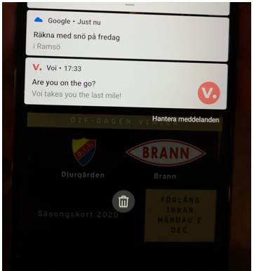
So what is happening here? Notifications are nothing new and exciting?
No, but that VOI in this case manages to send out a notification (external trigger) that is directly linked to my feeling at that moment (internal trigger) is quite unique. Personally, I associate notifications with something negative because they (almost) always manage to pop up at the wrong time, but if done right, you can absolutely push a behavior in the right direction.
(No, I didn't take a VOI, because my rational part of the brain managed for once to resist my irrational part's desire, it is, as everyone knows, better for me to walk than to ride a scooter).
You might think that designers never stop nagging about color, shape, and other boring stuff?
Designers, you might think that no one listens to your nagging? Since I am on your side, maybe you can get some arguments to get your stakeholders to understand that good design takes time, knowledge, research, and thought to create, and is extremely important.
Through color, shape, and function, we can influence behaviors and emotions. You know the classic example of A/B testing different CTA colors, which we at Conversionista often dismiss as thoughtless (rightly so). Recently, we tested changing the color of all Calls to Action for a large electronics chain, in an A/B/C test with Black, Orange & Red, separately on desktop/tablet and mobile. Red won on all devices. But why?
It is very difficult to determine exactly what in an A/B test triggers the behavior change (hello post-rationalization), so I will settle for stating that color and shape matter to draw attention to something. Let me simplify it as much as possible: If your entire site is red, then your main CTA should not also be red, because then it doesn't stand out, right?
Since we humans largely operate on autopilot, color, shape, placement, and function are very important pillars to guide our users correctly. A mistake I often see on various sites is that the design is inconsistent. Like "click on the big black button" means one thing at one moment, while in the next part of the flow, it means "Cancel" - yes, that was an extreme example, but you get it. In many cases, sites break conventions or natural interaction patterns. Take a look at the example below from Stadium's (previous) filter on mobile. Which button do you think I pressed when I wanted to see products based on my filter choice? And do you think it was what I expected?
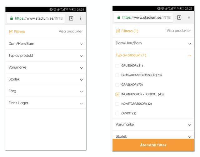
Left: Before I chose the filter. Right: After I chose the filter.
The more complicated and unpredictable your site is, the harder it is for your users to learn it. Of course, there are examples of very complicated services/apps/sites that are extremely popular (tax declaration on the tax authority's website, hehe), but I think you will agree with me that a common denominator for most services/apps/sites you like is that they are extremely easy to learn to use. Good Learnability, in other words.
And no, you can't blame it on "having so many features that it has to be difficult to learn." If you have a service or an app with many features, it might be a good idea to spend time and energy on a good onboarding. With onboarding, you not only have the chance to show users what is most important in the app, or what is most important to start with, and what is most important for the users should also be profitable for you, otherwise, you have much bigger problems than lacking onboarding. It is also an excellent first opportunity to improve Learnability. If your users quickly learn how to easily perform the actions required to satisfy their motivation, the chances are that they will do it again.