
In a previous blog post, Frida Morberg argued that many need to complement their quantitative data with qualitative research. You might have bought her argument but still wonder how to go about it.
For those who need a recap of Frida's post, here is a summary:
Quantitative data
Data that represents a larger sample of your visitors (think "counters").
You can confidently say – "Since I have seen this in enough of my visitors, I can reasonably assume it applies to most of my visitors."
Answers the question of WHAT happens, WHERE it happens, and HOW OFTEN it happens.
Qualitative data
Data that applies to a few of your visitors (think "observations").
You should think – "I have found a phenomenon that is very good/very bad, but I don't know how often it happens, who it affects, or what impact it has on my goals/KPIs."
Answers the question of WHY it happens.
Or read the entire blog post: When Did Data Become Only Quantitative?
Disclaimer: When working a lot with these data methods, you quickly fall into internal lingo and constantly say "quant" and "qual." It becomes sooo tiring to say "quantitative" and "qualitative," right?!
Now that we have clarified what quantitative and qualitative data are and that we should work with both, how do we get started?
In the previous blog post, we noted that most organizations have a (relatively) surplus of quantitative data. They have dashboards, live data, weekly reports, management summaries, trend reports, and deviation reports in an endless stream.
So they know WHAT is happening, maybe down to the smallest detail, but they still don't know WHY it is happening.
So let's start there.
We start with our quantitative data and then QUALIFY that data.
We illustrate the whole thing with a case from one of our clients.
One of our clients was a company for IP telephony. Their customers are often people who have moved abroad and need to call home to family and friends at a reasonable price. They offer their services worldwide, and their site is available in a plethora of different languages.
Additionally, they constantly run a lot of campaigns, so there are a multitude of different landing pages.
Our web analyst, Erik, sat down and did a data deep dive deluxe on all their landing pages. Most had roughly the same performance, i.e., about the same bounce rate, the same conversion rate, etc. But then he found a page that stood out. It had a much better conversion rate than average. Now he was onto something. Erik got a CSI feeling.
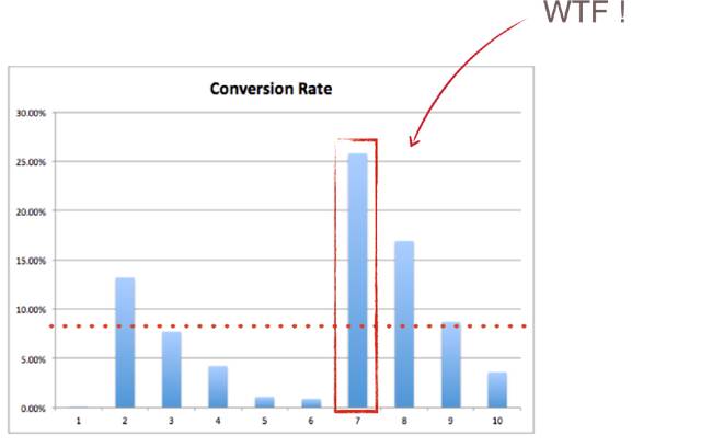
And then it was time to qualify the data. He had figured out WHAT was happening and WHERE, but not WHY.
Here it would have been tempting to skip the qualification problem and just go full throttle.
"This page is better than the others, just copy it and roll it out across the entire site – problem solved!"
But if we don't know WHY it is better, the risk is high that we don't copy the right things or that what we copy doesn't work on the other pages.
We had to go deeper.
Step 2 was then to qualify our data and try to answer the question of WHY visitors converted at a higher rate on this page.
We did what is called a "heuristic analysis." Heuristics is another word for "rule of thumb," and what we did was look at the page based on several principles of consumer behavior that exist in our project database.
Then we saw two things that stood out.
First, the page we looked at was the only one that told how many minutes one could call. If we say it costs 1 SEK per minute to call and you pay 100 SEK, you can either communicate:
Cost: 1 SEK/min
or
You get: 100 minutes
And something that is very well established in our own tests but also through studies in consumer psychology is that consumers are not interested in what they have to do, how they have to do it, what they have to pay, but WHAT THEY GET!
What’s in it for me.
So let's take that principle: Tell how many minutes the customer gets instead of what it costs per minute and use it on more landing pages.
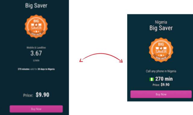
(We apologize for the pixelated screenshots, but it was the best we could get)
The second thing that stood out was that there was a small flag for the country you were calling to on the page.
This follows a psychological principle called the "Doppelgänger effect." It means that we as people take notice when we see a picture of ourselves, see our own name, or as in this case, see our own country.
We have proven this through tests of emails with the recipient's name in the subject line.

"John – here are this week's offers" has a higher open rate than the same text without the name.
You can also see how LinkedIn uses this in their ads on the site.
Here I see both my own LinkedIn picture and my name (LinkedIn hasn't forgotten that I worked in the gaming industry for a while).
Holy cow – now we've come up with something really good! Let's just cut it out and paste it across the entire site. Or?
Here comes the tricky part. Now we close the loop by doing an A/B test and proving our hypothesis with quantitative data. Our hypothesis was that "if we show the call time the customer gets and a flag for the country the customer is calling to on all landing pages of this type, the average conversion rate will increase."
Did it? You bet – double digits.
Now that we know how to qualify our quantitative data, let's find out how to quantify our qualitative data. And we do it, of course, with another case.
In this case, it was an e-commerce site that had a function to save the shopping cart. To do this, you had to log in to your account or create a new one. If you chose to create a new account, you were met with the registration form from hell. An apparently endless row of fields to fill in – just to save the shopping cart!
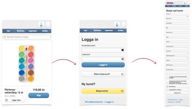
Here, our heuristic rules say that the visitor will turn away at the door. This is due to a phenomenon called "task switching." We HATE to interrupt what we are doing and start something new (try asking kids to stop playing on their iPad and come to the dinner table, and you'll see).
And we have seen it repeatedly in our tests and our data. Long forms kill conversion, especially if what you get in the end (a saved shopping cart) is not of great value.
Here, it was tempting to just say – "remove/rework." Or should we find out more?
Here, we felt pretty confident about why a certain thing happened. But it was not proven how often it happened, and what effect it could have on the business if we changed it.
Now we went back to quantitative data to substantiate our qualitative insights quantitatively.
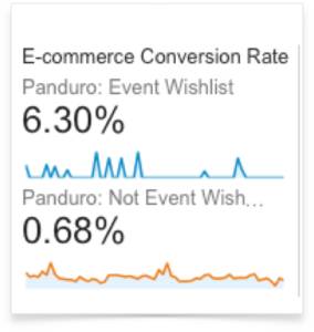
We created a segment to see how often visitors logged in to save their shopping cart. The result: almost never. 214 out of 357,000 visitors!
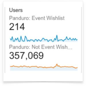
And then we looked at the conversion rate for that segment. It was almost 10 times higher than the average!
So now we had a behavior that very few did, but which was very profitable if it did happen. A great case for a redesign of this flow, in other words!
So now we have shown the two ways and directions you can work with quantitative and qualitative data.
So all good – just go for it, right?
Yes, in principle, but there are a couple of pitfalls you can fall into and that you should be aware of. Your worst enemies here are Confirmation bias, Quantification bias, and Multiple Comparisons Problem, and we plan to tell you about them in a later post.
Disclaimer 2
-----------
Heuristics = qualitative data?!
Rules of thumb may not be qualitative DATA, but they can be used as a qualitative method. The careful reader might object that in the examples I give, I do not have qualitative data collection methods but "only" heuristic rules of thumb. Well observed! I can agree that it would have been EVEN BETTER if we could have done qualitative studies that provided qualitative data DIRECTLY from the sites we worked with. We didn't have that, so we took qualitative insights (rules of thumb) from previous studies. Kind of the next best solution. And I think: if it's a method that delivers results – why not?! So are heuristic rules qualitative data or something else? That's a debate for the data scholars.
-----------
So are heuristic rules qualitative data or something else? That's a debate for the data scholars.
But regardless of the debate, the key takeaway is that combining both quantitative and qualitative methods can provide a more comprehensive understanding of user behavior and lead to more effective optimization strategies.
One of the biggest pitfalls in data analysis is confirmation bias. This is the tendency to search for, interpret, and remember information in a way that confirms one's preconceptions. It can lead to skewed results and poor decision-making. To avoid this, always approach your data with an open mind and be willing to challenge your assumptions.
Quantification bias occurs when you place too much emphasis on quantitative data at the expense of qualitative insights. While numbers are important, they don't tell the whole story. Make sure to balance your analysis with qualitative data to get a fuller picture of user behavior and motivations.
The multiple comparisons problem arises when you perform multiple statistical tests on the same data set. The more tests you run, the higher the chance of finding a statistically significant result by chance alone. To mitigate this, use proper statistical techniques and be cautious about drawing conclusions from multiple tests.
In summary, to be a successful optimizer, you need to leverage both quantitative and qualitative data. Start by understanding what is happening with quantitative data, then dive deeper into why it is happening with qualitative methods. Be mindful of biases and statistical pitfalls, and always validate your hypotheses with rigorous testing.
By combining these approaches, you can gain deeper insights into user behavior, make more informed decisions, and ultimately drive better results for your business.