
Looking for advice on HOW emails should be designed to maximize the chances of conversion?
Look no further.
We have gathered some of our best tips to answer the question.
You have captured leads for your email list and figured out when to send your emails, but how do we optimize the email itself?
As conversion optimizers, we talk a lot about numbers and statistics. So a natural starting point for this question is - what measurable numbers can we strive to optimize?
To summarize, you have 3 different values to work with here:
These are also the KPIs we will focus on in this blog post.
But, just because I mention these numbers now doesn't mean we will talk about "hard values" and data throughout the entire post.
This primarily provides us with a measurable starting point and a representative funnel of the intended customer journey that an email campaign actually entails.
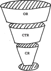
That said, let's start with Open Rate.
Open rate, or opening rate, is simply the percentage of recipients of your email who actually open the email in question (and not just press delete or mark it as spam).

Generally, we can say the text above determines whether subscribers will open the email or not.
We can state that you have very little space to work with.
As if that weren't enough, our inboxes provide a significant noise that the communication must compete with. And surpass.
I think we can all agree that emails usually overflow with different messages and offers – this is what my inbox looks like daily:

So reality check: we have limited means to work with, minimal attention span from our recipients, and enormous competition.
Those are the premises.
In other words, it doesn't look very bright... But don't lose hope.
The parameters we have to work with at this stage are: Sender, Subject & Pre-header, what "best practices" are there to adhere to?
Don't be afraid to be personal.
We A/B tested our emails in 2016 and found that emails with a personal sender not only had a higher open rate (+5%) but also a higher CTR (+6%).
In our case, "Lisa at Conversionista" tends to be more successful than just "Conversionista".
(BUT, a small disclosure, to know if this works for you too, you obviously need to test!)
There are many tools to use here, all of which focus partly on psychological principles, but primarily on copy.
Tips for effective copy for your newsletters:
Pre-headers are important.
Why?
Because:
The copy tips for the subject are absolutely applicable also for the pre-header, but to be honest, we can continue to discuss principles and guidelines forever…
In the end, the most important thing is still to focus on increasing the motivation for your subscriber to click into the email.
This means that the reader must get the impression that the value is greater than the alternative cost in terms of time and attention they are expected to spend.
Can't deliver any value in what you send? Then maybe you should reconsider the choice to send an email in the first place. No matter how much you optimize for people to read your emails, you can't put lipstick on a pig.

This brings us to the optimization of the next measurable value we have at our disposal – Click Through Rate (CTR).
You have reached the recipient and against all odds got them to click into the email, now what?
Here we reach another critical point.
The recipient has clicked into the email based on the promise of valuable content that you communicated with the help of a great subject line & pre-header.
But instead of a CTA to the enticing offer, the recipient is met with a "wall of text" like no other.
That, my friends, is a costly mistake that makes you lose leads, and in the worst case, get marked as spam.
So let's avoid that.
We humans are pros at quickly generalizing the content on a website (50 milliseconds - a little reminder there).
And honestly, the logic for an email campaign is not much different from when working with a landing page, so you can use similar thinking to optimize your newsletter.

Keep the scent...
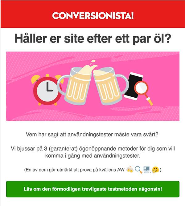
The keywords for optimized CTR are Relevance, Value & CTA, and by that, we mean that a recipient should quickly be able to:
Then you can also use a lot of methods to further convince the recipient to take action.
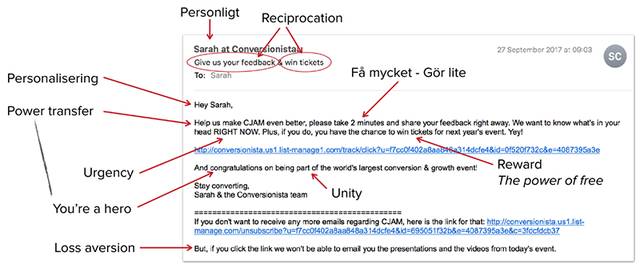
Our former colleague Sarah Hoof (who also deserves a lot of kudos for the basis of this post) did an excellent job with psychological principles in this plain text example:
Another very important thing to consider when optimizing the design of an email campaign is to place Relevance, Value & CTA "above the fold".
Because people still don't know how to scroll.
Yes, that applies to emails too. Period.
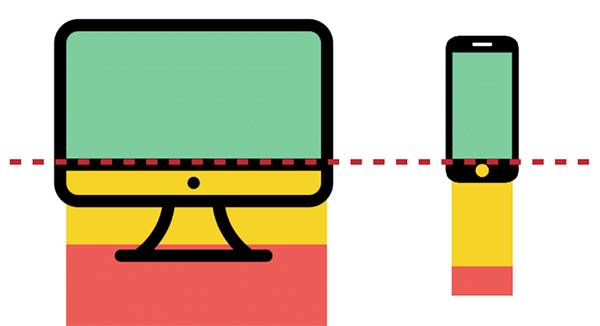
Think about that limited attention span again. If you place your CTA below that red line (or fail to "break the fold"), you're done.
Okay, but now we're getting somewhere, right?
We have a message that motivates recipients to open the email.
What meets the readers is not a "wall of text" but a nicely designed email that matches the expectations built up in the subject line & pre-header.
Of course, with a clear CTA located above the fold.
BINGO! The recipient clicks through to your landing page…
The last little trick we need to achieve is to ensure that the user actually does what we have been working towards since the email landed in the inbox.
And yes, it's easier said than done, and probably the most complex part of the entire funnel - optimizing landing pages is a science in itself.
To generalize something that we can actually apply our entire CRO methodology to, we summarize here just a few of the tricks that are applicable specifically for customer journeys that start from an email campaign.
It mainly involves:
Well, maybe not, but we have come a long way.
Now it's time to reconnect to those numbers and statistics we talked about at the beginning of this post.
Because of course, you should make sure to UTM-tag, look at the data, and A/B test headlines and content. What works and what doesn't?
Make changes based on your observations, and then do it all over again.
And again.
In summary: How do you optimize a newsletter? The same applies as for all other CRO work, look at the data and never stop testing.