Whether you're creating a blog post, a push notification, or a few lines for a Facebook ad, writing can seem like the hardest task ever.
Good content requires a lot of trial and error to get it right. At Blinkist, we've made all the mistakes - so you don't have to. After 2 years, over 200 tests, and hundreds of hours in the writing room, we've turned our magazine into a powerful tool for acquiring new users.
In this post, I share the five most important lessons for creating content that sells.


Get your ticket to Conversion Jam here!
Sometimes the hardest part of marketing a product is believing in it yourself. Every product has something worth fighting for. Find out what it is and write 500 words about it. I guarantee it will help you.
Don't believe me? Simon Sinek's bestselling book "Start with the Why" describes the rise and fall of companies that have forgotten their mission. When a product becomes more complex, it's easy to forget why it was created in the first place. Content marketing forces you to tackle this challenge.
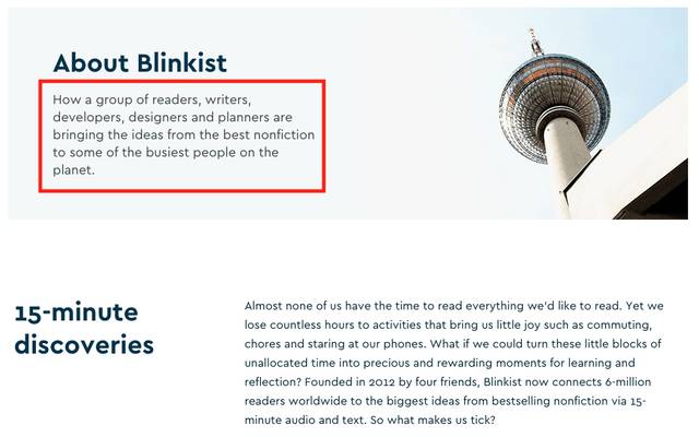
Take our app, for example. On the surface, Blinkist is a reading app that turns nonfiction books into digestible content. However, it is much more than that - it is a learning tool.
That message was not only more inspiring, but it was also better for our results. By including our core value on our landing pages, our conversion to registrations increased by 39%.
I encourage you to reconsider the foundation of your marketing message.
Does your content convey the core value of your product? If not, dig deeper.
Once you've found a strong core message, back it up with more arguments. Unfortunately, unlike a university professor, the typical reader will give you 30 seconds before grading your text.
This may seem unfortunate for humanity, but it is actually a survival instinct we have developed to protect ourselves from all the noise on the Internet.
To appeal to the modern reader, write your articles like an inverted pyramid - put the most important things first.
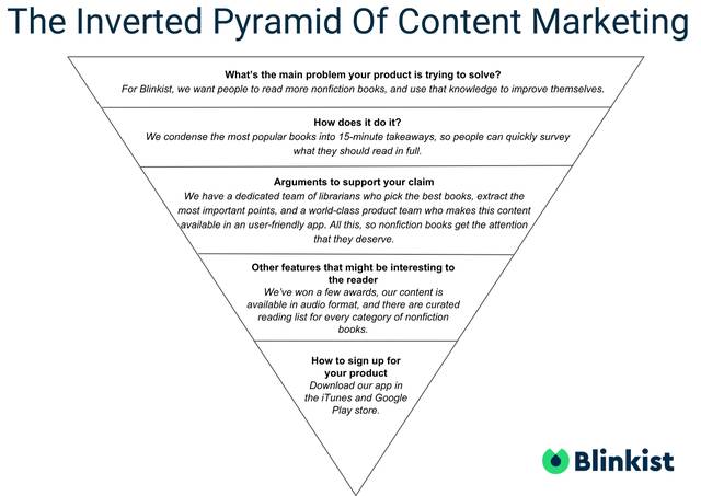
What is the biggest problem your product is trying to solve?
As for Blinkist, we want people to read more nonfiction books and use that knowledge to improve themselves.
How does it do that?
We condense the most popular books into 15-minute takeaways, so people can quickly map out what they should read in full.
Arguments to support your claim.
We have a dedicated team of librarians who select the best books, subject matter experts who extract the key points, and a world-class product team that makes this content available in a beautiful, easy-to-use app. All this, to give nonfiction books the attention they deserve.
Other features that may be of interest to the reader.
We have won some awards, our content is available in audio format, and there is a curated reading list for all categories of nonfiction books.
How to sign up for your product.
Download our app in the iTunes and Google Play store.
Notice that we wouldn't start articles with what awards we've won, because even though it's nice, it's irrelevant before we present good arguments for our app.
For you as a writer, this means that:
You don't need to spend days making your content perfect - just make sure you mention the right things.
Now I've given you an idea of how to provide valuable content, but is that enough?
The answer is - no. Good content forms a strong foundation, but good layout and design take you all the way to the finish line. To put this in perspective, here's how important each aspect of an article is:
50% of the result
What you write (What problem is your product trying to solve? How does it do that?)
How you write it (how will you tell that story in an engaging way?)
30%
Layout (does it look trustworthy?)
Conversion elements
20%
Supporting content (images, videos, etc.)
Design (is the branding consistent?)
Take this test for example, by changing the styling of quotes we managed to increase conversions by 17%.
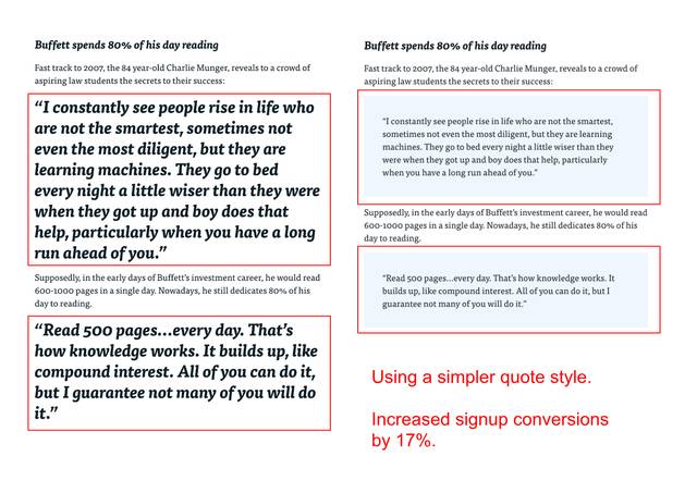
Most of the time, the simpler (sometimes less pretty) design works better, but that doesn't mean the internet has bad taste, rather that readability is more important than aesthetics.
Therefore:
Even though content is important, it should only take up half of your time, devote the rest of the work to layout and design.
In content marketing, "content" comes first. Your job is to give people valuable content first and then convert them.
All our pages have a "smart banner" - an app download prompt that sticks to the top of the browser as readers scroll. Beyond that, we have had very little success with other conversion elements.
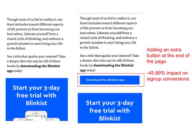
We tried adding buttons where visitors tend to drop off:
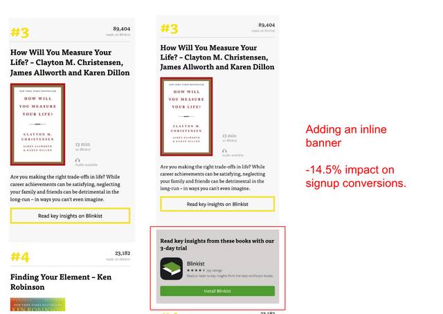
We tested halfway/inline banners because everyone else had them:
We also tested anchor texts (texts with links) for those who are banner blind, but that didn't improve conversions either.
These conversion elements did not do a good job of capturing readers we had already lost and frustrated engaged readers who would otherwise have converted.
We ruined a good reading experience to appease the wrong people.
After too many failed tests, we decided to keep our layout simple and rely on good content to achieve our conversions.
Our rule of thumb is:
Keep conversion elements to a minimum and only add extra ones when the content allows it.
The final lesson in this blog post is a warning: don't take your work too seriously.
I mentioned earlier that people don't read articles but scan them. As a result, they follow an F-pattern when reading. You can see an example below.
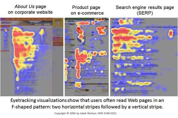
This means that:
Sometimes it doesn't matter how long your article is, what images you use, or what fancy banners you have, readers will ignore everything outside the F-pattern.
We discovered this after 5 failed tests where we tried to find a better banner image.
We had an article with a banner image of a woman's back. We thought "this is not the most inspiring image, we should be able to do better."
We first replaced it with an image of a woman looking up from her phone, as if she had experienced something captivating. It's important to note that this was one of our best ads on FB, Outbrain, and Taboola.
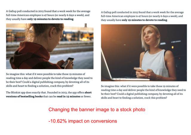
How could it go so wrong? Because it really did. By using the image on the right, our conversions decreased by -10. .62%.
Our first instinct was that people shy away from stock photos, so we tested a new image of one of our colleagues.
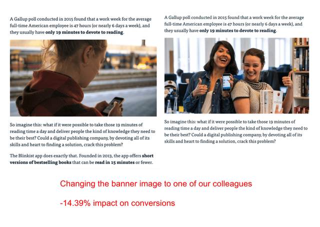
They were even worse - our conversions dropped by -14.39%.
Now we thought - "if it doesn't matter what image we use, do we need an image at all?". So we tried removing it altogether.
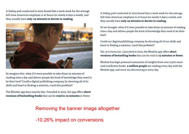
What happened next was no surprise - the original won again.
We didn't stop there, we also tested moving the banner image up and down, but nothing beat the original. We were stuck with a boring image that couldn't be replaced, removed, or repositioned.
Here it dawned on us: we were wasting time chasing small things when we could be doing other more fun and fruitful things (like taking a Friday afternoon off to cure our tired brains).
The lesson is clear:
It's pointless to obsess over every little bit of an article, focus on the big things and iterate within the F-pattern.
As you can see, content marketing is not only good for growth - it's an opportunity for companies to reflect on their values. Follow the advice in this article to get started – simple as that.


Get your ticket to Conversion Jam here!